
Ember Center: Rebrand Case Study
Challenge accepted
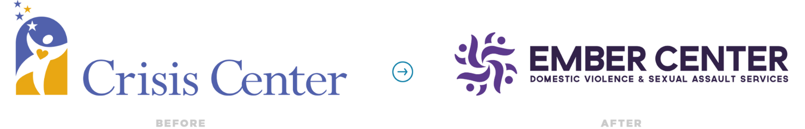
The Crisis Center, a long-standing organization supporting victims of domestic violence, faced a defining moment. After nearly four decades of evolution—from the Women’s Crisis Center of Douglas County (1985) to simply The Crisis Center (2013)—its name and visual identity no longer reflected its expanded mission or the modern understanding of intimate partner violence.
The word “crisis” limited perceptions of their work, implying short-term emergency services rather than the comprehensive, survivor-centered support the organization provided, including shelter, community advocacy, therapy, and legal aid. Internally, stakeholders sought a brand that communicated empowerment and transformation—one that could both welcome survivors and convey professionalism to partners and funders.
Complicating the challenge was an already crowded landscape of domestic violence service providers in Colorado. Many potential names were already taken, too similar, or lacked the emotional nuance the organization needed. It was time for a rebrand that honored their legacy while boldly positioning them for the future.
Solution proposed
Strat Labs led a deeply strategic rebrand process grounded in empathy, collaboration, and creativity. Beginning with extensive stakeholder interviews and workshops, the team distilled the organization’s core themes (safety, empowerment, growth, and well-being) while also identifying language to avoid, such as “crisis,” “emergency,” and other overused sector terms.
Using this foundation, Strat Labs developed a structured naming framework focused on concepts of roots, renewal, and resilience. Over five rounds of creative exploration, names and logo concepts were refined through stakeholder feedback and emotional resonance testing.
A few names rose to the top. Surveys with more than 60 board members, staff, donors, and survivors provided data-driven insights on emotional impact, clarity, and mission alignment. Ember emerged as the strongest contender, symbolizing endurance, transformation, and inner strength.
The final selection, Ember Center, was paired with the tagline “Igniting Hope, Empowering Change.” Strat Labs then designed a new logo: an elegant circular mark featuring abstract human forms intertwined with flame motifs, rendered in a purple and teal palette representing domestic violence and sexual assault awareness.
Together, the new name, logo, and tagline formed a cohesive identity that captured the organization’s survivor-centered mission while distinguishing it within a saturated sector.


Problem solved
With the launch of the Ember Center, the organization is now positioned with a clear, confident identity that reflects both who they are and who they aspire to be.
- The rebrand transitions their narrative from one of crisis to one of empowerment and renewal, helping reshape public perception from an emergency-only resource to a long-term partner in healing and growth.
- The new visual identity—modern, meaningful, and grounded in symbolism—instantly strengthens recognition and emotional connection across audiences.
- The purple and teal palette honors awareness movements while projecting warmth and inclusivity, and the integrated logo elements communicate the organization’s four core services: shelter, community advocacy, therapy, and legal advocacy.
Early feedback has been overwhelmingly positive. Staff feel proud to represent the new name, board members see renewed energy and clarity, and donors report feeling more connected to the mission. Survivors, too, have responded to the word “Ember” as a symbol of their own enduring strength and capacity to rebuild.